FrogLegs Redesign
A design project for the FrogLegs website and the SCC WEB202 course.
Background
Froglegs Kids Culinary Academy is a cooking school for kids ages three to fourteen. They have a static website that is visually branded as a business for children.
The Challenge
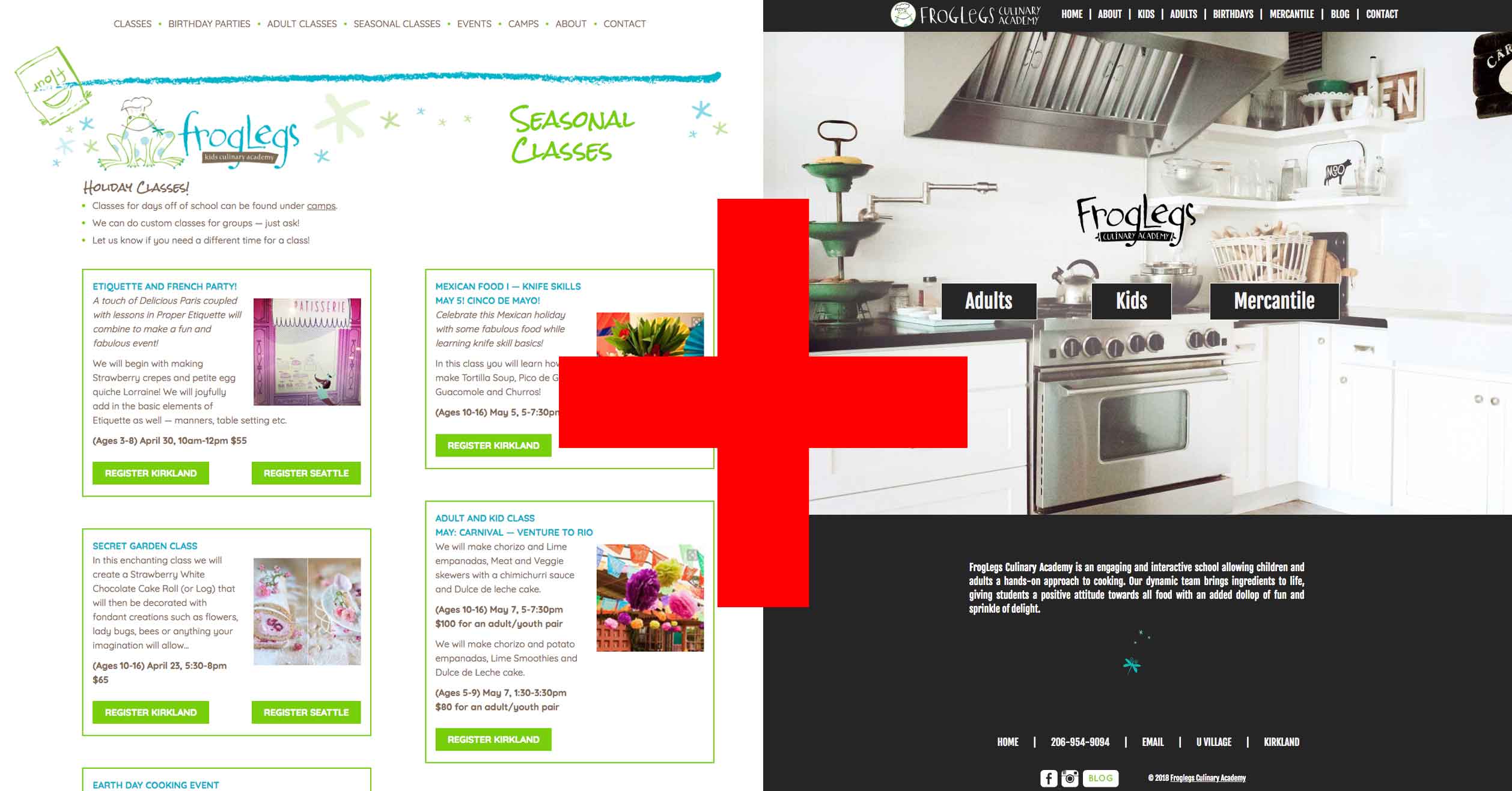
Froglegs is expanding their business and offering adult cooking classes and products. They need to expand their website accordingly, with styling that speaks to an adult customer base. And they need to retain the current look and feel for the kids offerings.
The site was split into two sections, branded and styled for kids and adults respectively. The challenge was to do this without making navigating the site confusing, and without surprising existing users too much.

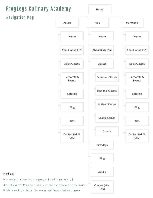
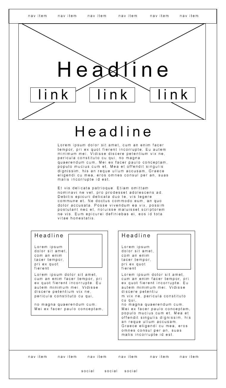
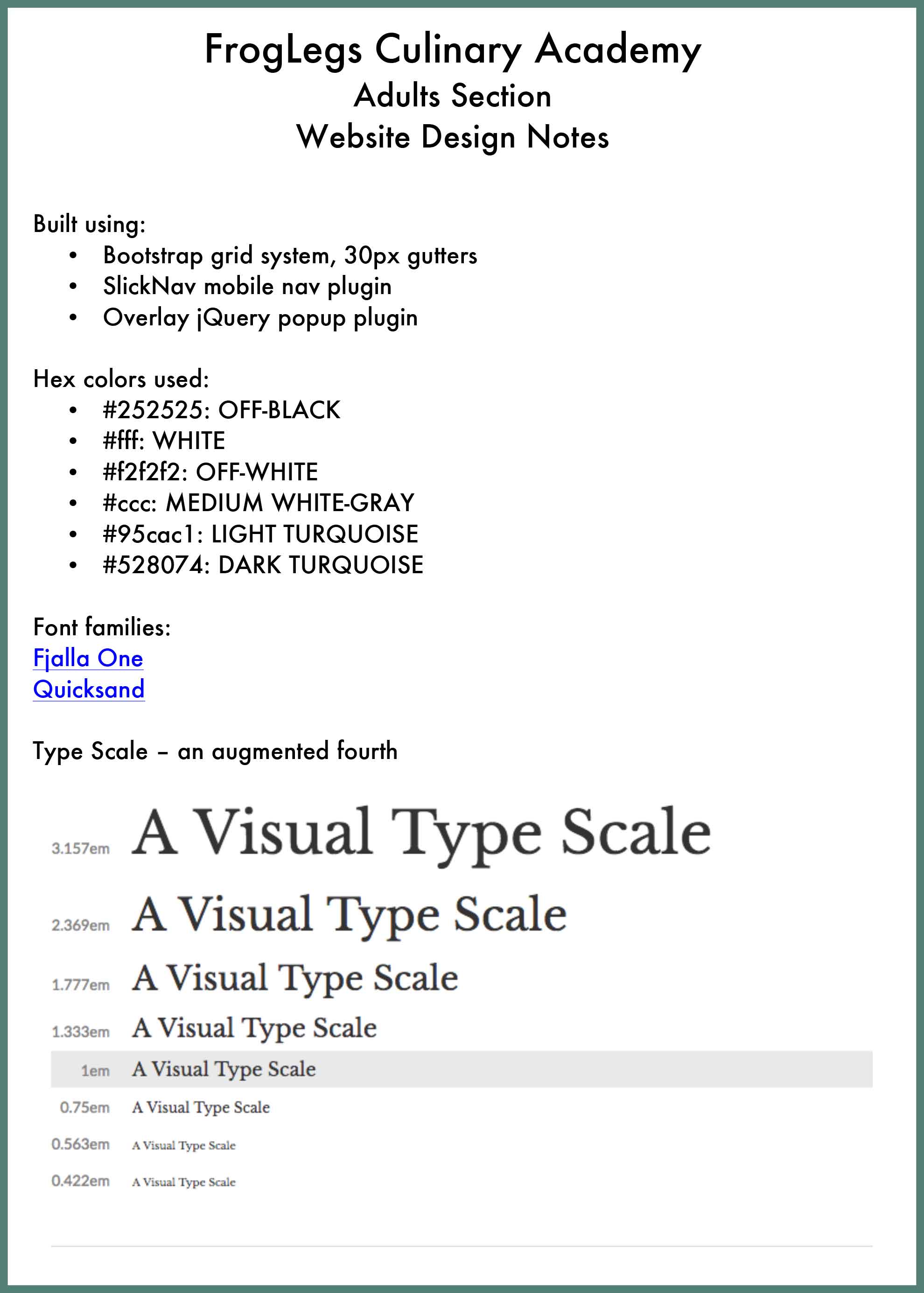
Multiple sections of the site necessitate multiple navigation bars. This map shows two full nav bars for the Adults and Kids sections, and a stub page for the Mercantile part of the business, which shares the Adults nav bar.
The landing page/homepage has no nav bar but rather displays three prominent links to direct users to the section of the site they need.

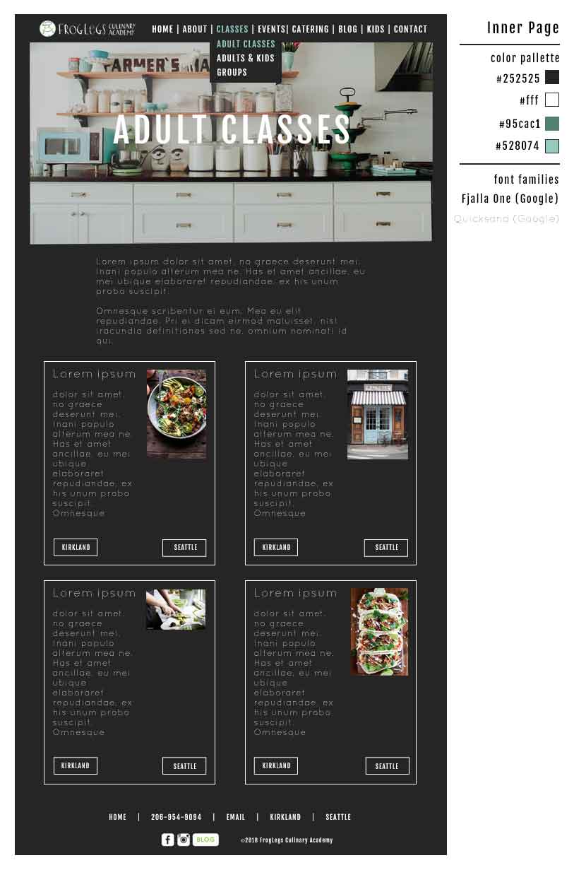
Inner pages in the Adults section displays a similar splashy image at the top, and similar link boxes on some pages where appropriate. And of course they will display the nav bar.
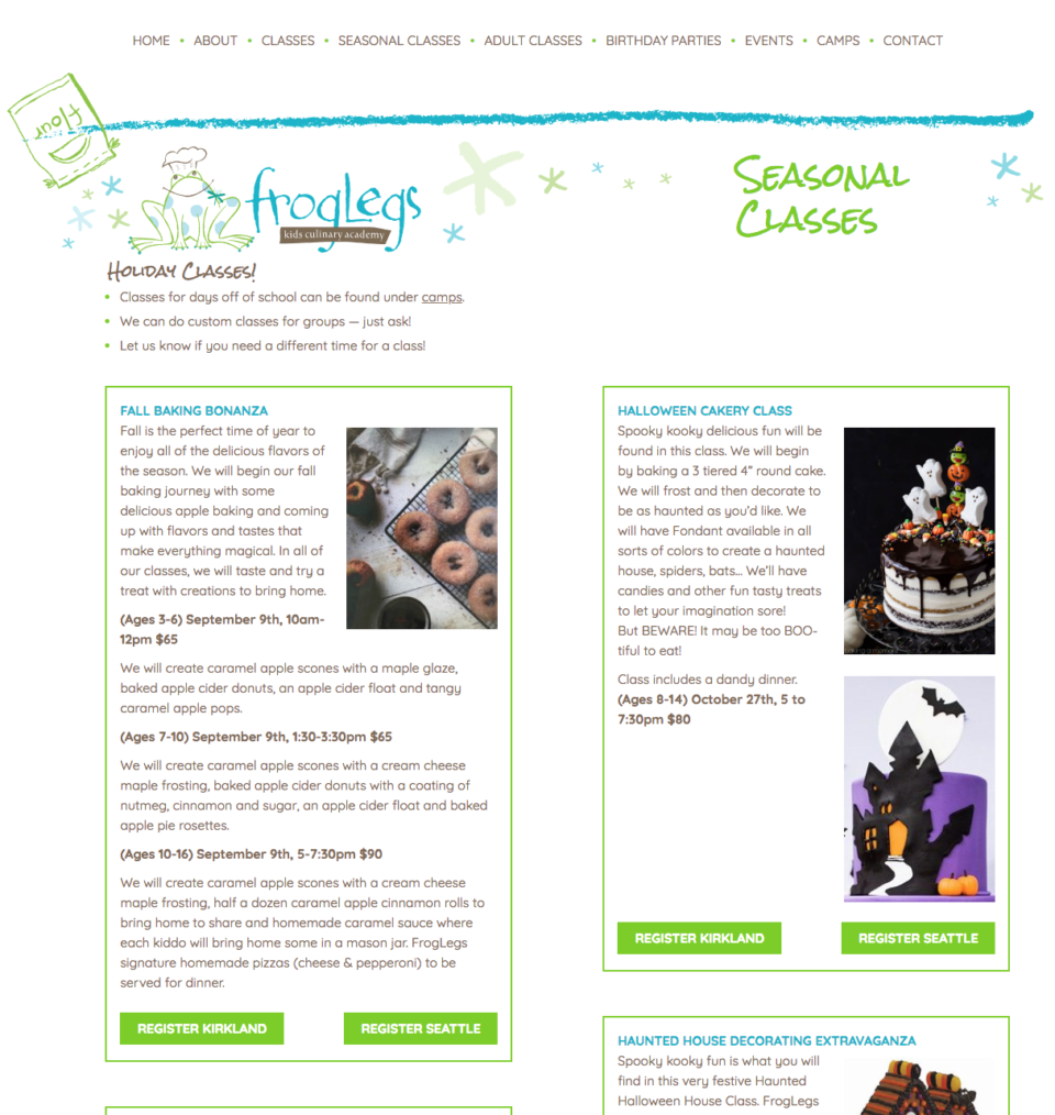
The home landing page was designed with professional photography of the FrogLegs facility in Kirkland. It utilizes the basic look and feel of the new Adults and Mercantile sections.
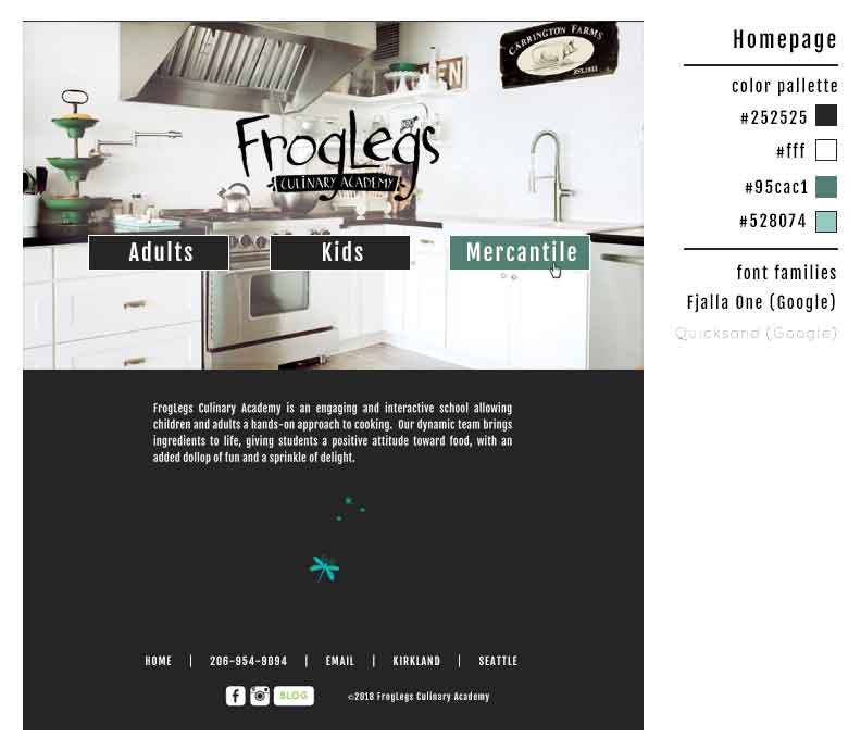
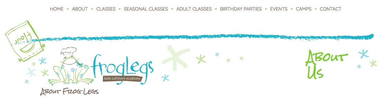
The inner pages are designed to mimic the appearance of a fine dining restaurant menu. A new, more muted color palette was selected using the neon Kids section colors as a starting point. The layout of the class displays will be familiar to existing users of the website.
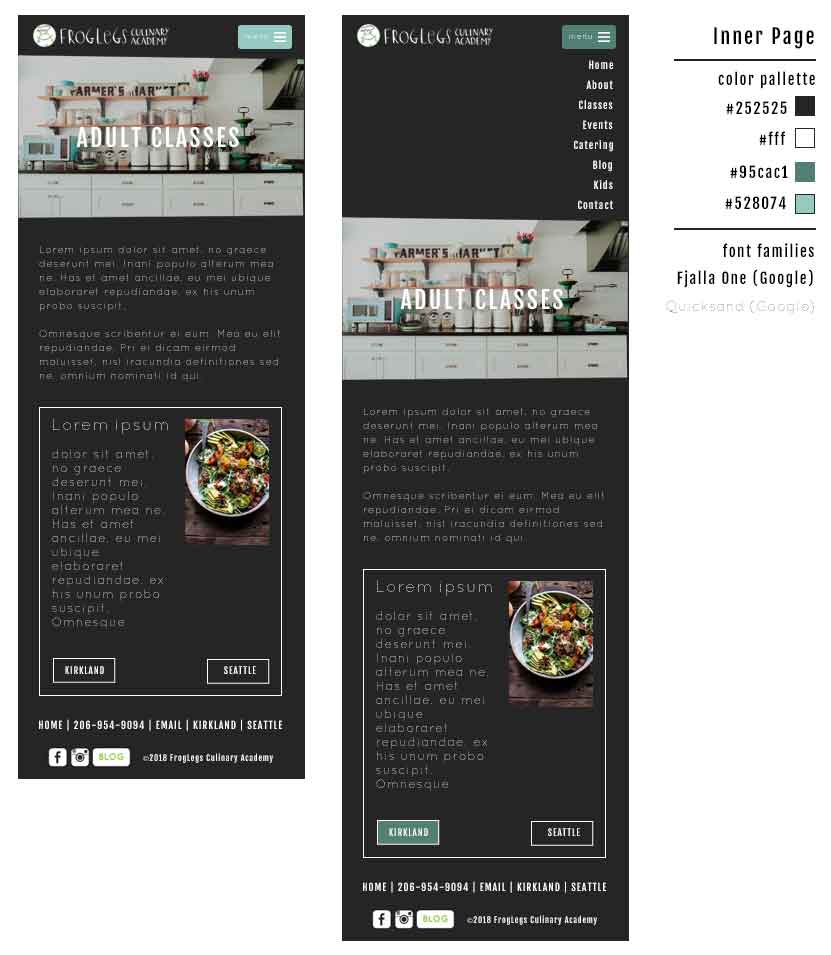
At 767 pixel viewport width, display goes to single column wide and the nav bar is replaced with a hamburger button. The site utilizes the Bootstrap Grid CSS and SlickNav plugin for this.
In addition to the wireframes and visual designs, specifications were produced for future maintenance of the website. These specs and all other design documents were compiled in a folder.
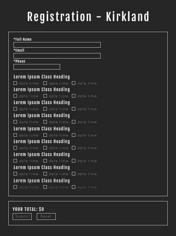
Registration Redesign
The new Adults section of the site required its own registration pages to keep the look and feel intact throughout a full session.
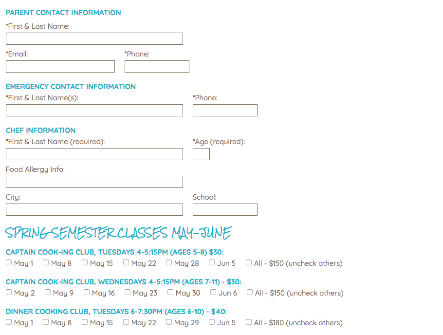
The Kids registration system was onerous:
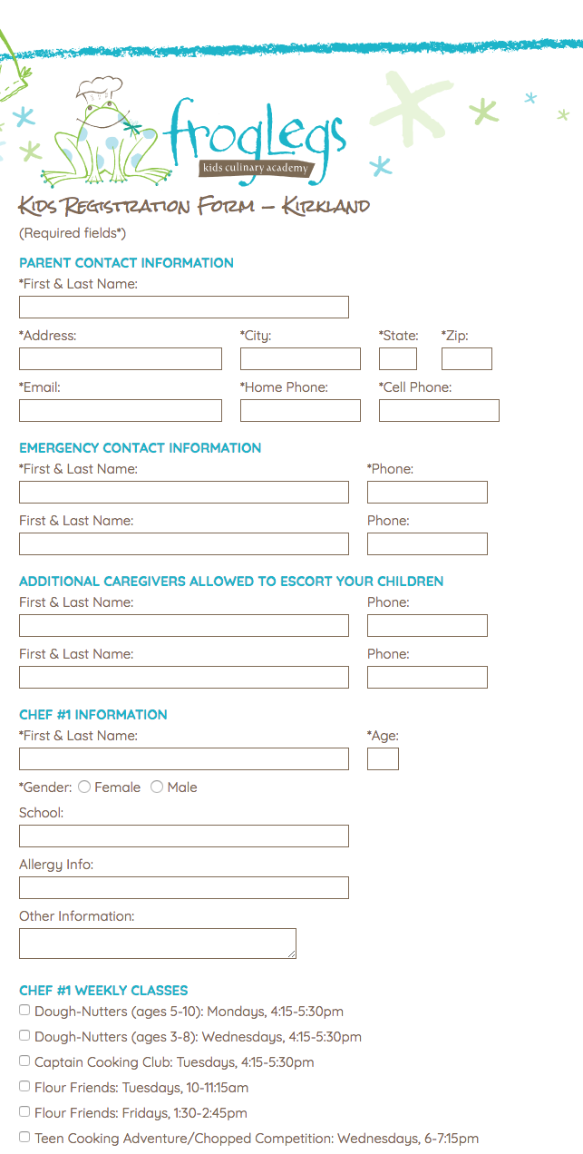
…and underwent a similar paring down, though it was not possible to remove all of the entry fields for the kids.
Payment System
FrogLegs had long used a PayPal button system for their payment page. This had numerous problems. Beyond being non-searchable because of utilizing dropdown menus, it required users to click through the entire page and find everything they had already registered for, and then click on it again to pay for it.
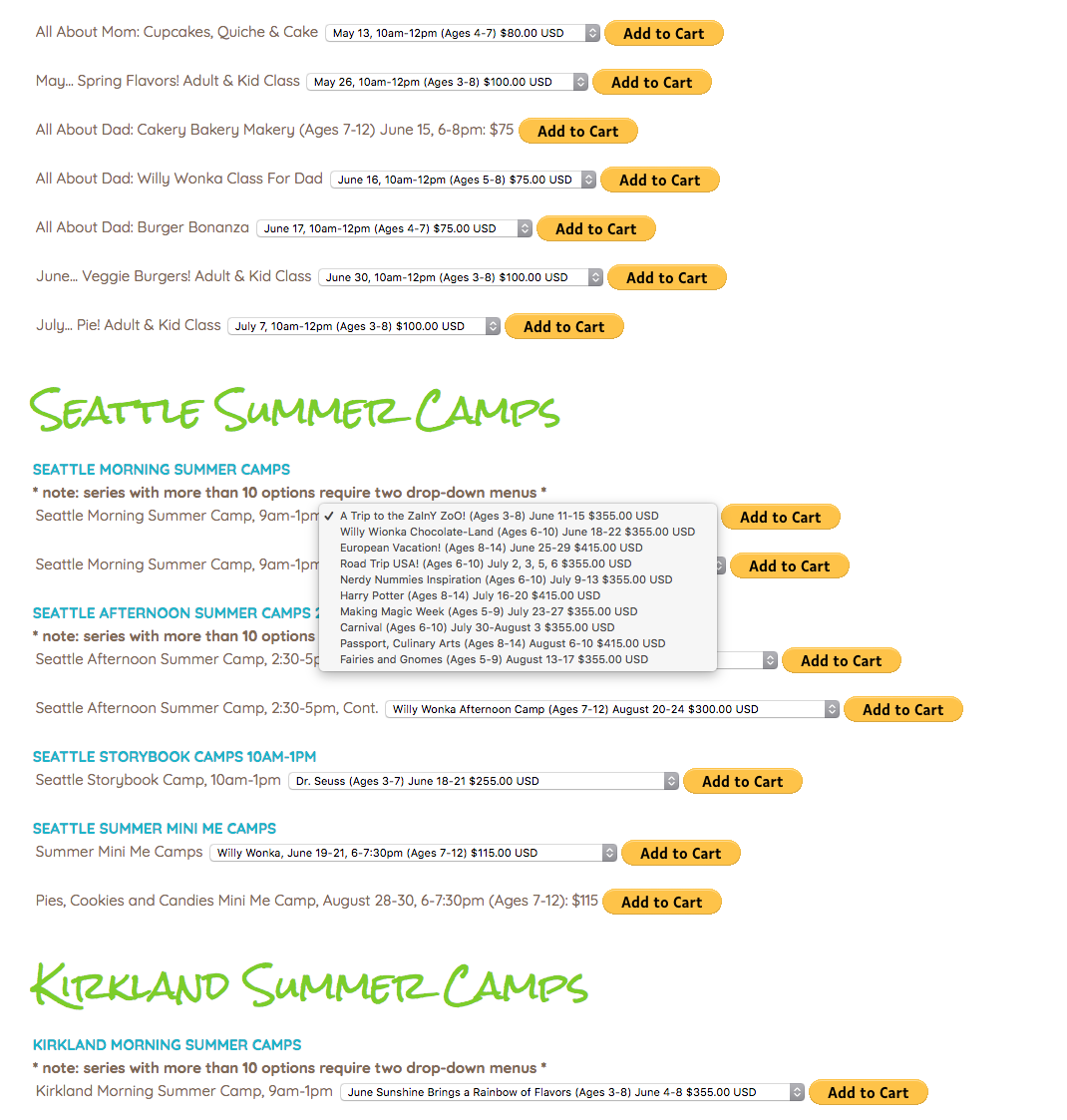
Concurrently with the redesign project, FrogLegs switched from this payment system to a credit card processing service called FattMerchant. The payment system was simplified accordingly, from a page with dozens of (non-searchable) PayPal dropdowns and buttons to one that simply added the prices of everything they had registered for and presented a single button to pay.
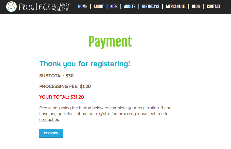
jQuery was used to generate an order number for the desk employee who received the registration and payment notifications.
What’s Next
A similar but less encompassing redesign of the Kids pages is in order next, removing the spaghetti code of several developers (the registration page was aligned using tables) and implementing Bootstrap Grid.
The ultimate goal is a WordPress site using these styles and a powerful registration and calendar display plugin to offer users a better way to view and select classes, as well as a login system to save them time and retain them as customers.